Even though the graphics aren’t entirely complete, the creation of the small enemies is done for now. Next, we’re moving on to create the mid-boss, room guardians.
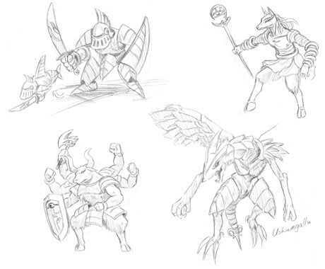
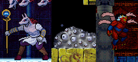
Speaking of mid-bosses, this is one of the highlights showing the game’s milestone. Even though it’s not a massive boss, we still want somewhat of an impact. That’s how several room guardians have grown larger in size when compared to the original version. Also, some of the older designs have changed along the way.
The room guardian’s size is big so, unlike the small enemies, the shape must be firmly decided before creation. Otherwise it’d never be high-quality. We can’t just go for an attractive design, but must consider things like movement of segmented characters and economizing parts.
Within the movies we’ve shown up until now, there are room guardians made by multi-joint, segmented construction called [ Algos ] and [ Buell ]. Actually, there are people who don’t like this, but there’s a good reason for it.
We can understand the opinions regarding the departure from the retro game feel of the original. If you think about games coming out in this era, simply doubling the size of smaller enemies would be quite ugly.
Furthermore, this time around the animation of smaller characters is much more details with more patterns and design than the original game. The fear is that if the room guardians movement is as rich as the smaller enemies, then the image data would look quite cumbersome and a bit overkill.
With that, the image milestones were made and the segmented construction was adopted to enhance the rich animation. This time, the aim of the new La-Mulana itself is the evolution of a 2D game, so we thought it was natural to put in the segmented characters.


Very nice article and straight to the point. I am not sure if this is really the best place to ask but do you folks have any thoughts on where to employ some professional writers? Thanks 🙂
I am sorry, that has interfered… I understand this question. I invite to discussion. Write here or in PM.
Oh, man… I was skeptical before about the “segmented” approach to the large enemies. After seeing the latest video with the Algol, though… damn! I can’t wait to see these bosses in motion!
There probably isn’t much they can do, unless they ask Konami. Nigoro already said they wouldn’t do that, though.
I should clarify, I meant variety of songs.
That never stopped the guys who made Doom. They had samples from a variety of games, and that never stopped them from having the similar sounds in their level music and selling it commercially. If it’s original enough it deserves to be played here. I don’t like Aqua Wish :/
I think they have to change the music due to copyright; if I’m not mistaken, Curse of Iron Pipe is too similar to another game’s music.
Sadron:
From the looks of it, they don’t have much choice:
Since previously they said some of it was lifted from another MSX game, they have to: http://www.youtube.com/watch?v=flspAofUIIQ&feature=response_watch
On a side note, I heard that you guys were changing The Spring in the Sky’s theme to the unused track Aqua Wish. Don’t do that :_( Curse of Iron Pipe is so much cooler T_T
Really great work, beautiful stuff, I’m super shocked this is WiiWare, it looks like it could rival the Castlevania DS games.
I think segmented enemies is okay, I don’t remember that Anubis guy but it looks cool, also the design of the submarine/armor reminds me of those older RPGs.
I love these room guardians, both the ones I recognize and the ones I don’t! By the way, is Anubis trying to use his staff as a lance?
My main concern with segmented bosses is that they look like ragdolls or mannequins, but if all of them are animated like the Algol and Buer then it’s almost impossible to tell the segment apart. Great work guys, this is coming out great!
The guy with the staff, his hand is backwards. Or upside-down. You can tell his hand’s orientation changed from the sketch to the pixel version, so now he’s holding the staff upside-down or something.
Cool! I love those sketches of the enemies!
Nice.
…is that what Shu’s supposed to be? A bull? I always thought he looked like some four eyed six-armed beetle monster. Oh well.
2D forever!
2D will never die! Can’t wait to play this.
I really like what you guys have done with the bosses so far. I think the multi-jointed type bosses look really cool in games and you can hardly even tell that they are jointed in this from what I’ve seen. Keep up the good work guys I’m really looking forward to playing 😀
As always, bravo!
Buer (Or Buell, whichever translation) has always been my favorite boss, even including the big baddies.
I was super stoked when I saw him in the last video, and I actually really like what you did with him, it’s really smooth and fluid animation.
This is definitely a nice look into the creative process. If the minibosses have this much work to do, I can’t imagine the work needed for the main bosses.
Now I understand why you chose the route you did for large enemy animation.
It looks good. Great work guys!
Honestly I think the ‘segmented characters’ make sense, especially since Konami and Treasure have used similar in their games, so at least that much is staying true to the ‘Konami tributes’ this game originally had.
Thoughts on these images and in-game sprites? Bring ’em on!