As I mentioned the last time, there isn’t a changeover switch in La-Mulana WiiWare for the original version’s graphics and music.
Sorry, we can’t do anything about it.
There’s not enough space to contain both in our WiiWare version.
Since I’ve already explained why we remade the graphics in our process and policy, I’d like to share the story of how we came out with the new graphics we’ve introduced..
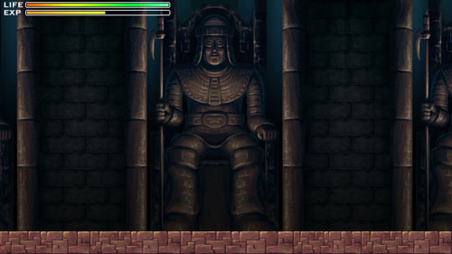
This is the first image I made it.
We weren’t originally planning to make this for Wii. However, one possibility I had thought of was Xbox or XBLA. That’s why the resolution is high (wide screen)
Once we moved forwarded and decided on WiiWare, I did research on Wii specifications and began creation with artwork roughly at 640×480.
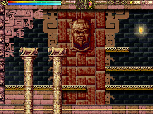
In order to complete this picture, it required a great amount of research on my part. There’s also a mountain sketch I’d like to share, maybe next time.
At this point, I was so excited and enjoyed filling endless drawings. It was like a dream to experience this next-generation machine, made possible by 640×480.
We finally had the framework to start exploring using actual equipment. We began having a better understanding of the project. But, then, we had to face an unexpected situation.
Estimating the number of images for La-Mulana + estimating extra element = capacity shortage.
We were in trouble.
The rough image I had created was already too large for this.
The options I had were 1) bring back the map parts to the same level with the old version so that people can enjoy the high-resolution 2) increase the number of map chips offering a completely different map even though the resolution had to be lowered.
It’s hard to judge which one is better because I can’t see the future. I took the latter and retried making graphics entirely.
I had to change the resolution to 320×240.
That was the only option I had. I also had to redo the pixel art entirely.
Two other team members told me that they thought the low-resolution actually suited the game well because the low-res images are, somehow, calming.
These days, artwork affects sales. At this point, I wasn’t certain what was a better solution.
I had to gamble.
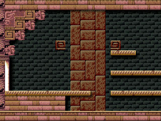
Based on the high-resolution images I had made, I was making low-res pixel art felt strange…
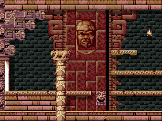
I drew and drew to create the same quality images that I had made for the higher-res version, but it felt strange.
Why is that?
I actually felt something during drawing. That’s petty.
That’s why the quality was covered up by high-resolution must be appeared by low-resolution.
The quality might have been handled with color balance and the overall feel is important; especially when the details have to be decreased.
Otherwise, it’ll look poor, like MSX graphics that are directly applied to MSX2.
Damn, why am I so horrible with pixel art. I must die! I must! No, no, hold on–I can’t.
I paused from working on the graphics. I had to hold a Naramura meeting in my head. (24 members of the meeting have discussion in my head).
I don’t think it was wrong to develop the image from what I already have. Am I missing something?
First, it totally lacks the spatial effect. There’s no perspective, no depth and no reality.
Why is that pixel art so beautiful in the retro-game era?
The answer is color.
Therefore, I came up with a new way to organize color in the image.
Then, I need to recover from the lack of presence that is the result of the pixeling.
Generally speaking, the drawing process involves consideration of the picture as a whole, but the pixeling process is like filling in minimum information. As a result, the image ended up so disorganized (you can’t tell if it’s a rock or what).
I created a new way to build the graphics. I could create the graphics using full color images without losing the retro feel. This is research that I have been developing since I started NIGORO.
I guess I can’t really say this is pixeling.
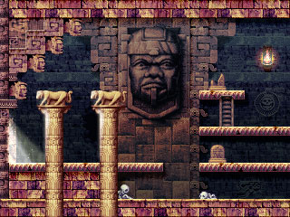
Anyway, this is how I came up with this image. I decided to go with this style. I was satisfied with the result and also other members agreed as well.
However, I recently found out that some TV sets won’t show the status parts that are created with this resolution..
We came up with some possible solutions and we think the safest way is to change the resolution to 512×384.
I don’t think I should redraw the entire image yet. I would like to find a way to change the configuration on the screen size and status settings.
This is how we produced the graphics.
Some may wonder that the change we made for the graphics may cause decreased visibility of the characters and traps in the game. We, of course, considered that aspect as well.
At this point, we just started making traps and enemies.
We are pixeling to create the main character and enemies. We consider the important on separating the characters against the background.
The Professor’s proportions are also slightly better.



Wow, you redid the graphics that many times? I really wouldn’t have the patience for that!
Please, oh please release this on XBLA.
For the love of god I want to play this remake badly, but not on the Wii.
40MB? Seriously? Wow, that IS harsh.
One thing I noticed is how a lot of people have already commented on the fact that the finished image looks best out of all the possibilities.
I don’t think it’s any coincidence though… even though the first image may in theory be better cause of it’s higher resolution it lacks a lot of the charm of the last and final image that was decided upon.
For the reason that more work went into the last image, not to mention lots of care and thought as well. It may have been more troublesome downsizing the image but the end result in fact a higher quality image. It’s a weird thing but hi-res doesn’t necessarily equal high quality.
Te first hi-res image in fact doesn’t feel like La-Mulana, while as the process went on it felt more and more like the original game. I can’t wait to see how it turns out over all. I hope the music is done in a similar style as 16-Bit era games.. a bit odd to say but I think 16-Bit era sounds would fit the game perfectly.
I recall reading somewhere that you can file for an file size exception to go above the harsh 40MB file size limit that currently exists for Wiiware titles. You may want to check with Nintendo about file size exceptions. Hopefully, one day soon Nintendo will up the pathetic file size cap.
As an artist myself, I love seeing your thinking process and the amount of effort and detail you bring to your work. I knew that the size limit of the wiiware would eventually limit your work somewhere such as with not including old graphics. However, your current style really gives a new taste to La Mulana. I would really be interested to see how the other fields have changed as well as their design process. I personally would love to see the monsters and their changes, too. This scene really turned out great! I like the way that you maintained a similar color palette to the original. Will all the maps be the same? I would be interested to see what changes have been made (That and the controls for this game). If there is any criticism about the new graphics it would be that Lemeza in the original looked more fluid. When he falls, he grabs his hat with a sense that it would blow away if he didn’t. In the trailer, he and his hat seemed rather stiff, but it maybe just my opinion. With less than three weeks of September, I know that winter 2009 seems like a difficult release date but I have confidence in you guys.
La-Mulana’s entire soundtrack in .sgt format is less than 4MB, and that’s too big for WiiWare? The capacity must be insanely low… in which case I really admire what you guys are doing. Keep it up.
Any way you guys can use the ‘LIFE/EXP’ or ‘VIT/EXP’ bars from either of the first two images? I know that the setup was a throwback to the original ‘The Goonies’ game on MSX, but without it the game would probably just…. feel weird without it.
Either way, waiting with bated breath for the next update with any new tidbits/screens/info! 😀
Wow, I really love how much effort you’re putting into this. Keep up the good work! Also, I was wondering how exactly some of the MSX jokes would be remade into the WiiWare version, like the names of the MSX games, or the Maze of Galious segment. (Kudos on hiding MSX in the computer name, by the way) And, of course, the infamous forbidden treasure end of Hell… the image was hilariously cruel and will be burned into my mind forever. Please preserve the difficulty level if you decide to keep it in the game; it’s called HELL for a reason, after all!
This is really fascinating. I think the art in the original version of La-Mulana is absolutely gorgeous, and am more than pleased by the new artwork. Even though the color sense is very different, it’s still very rich and very satisfying.
You’re really critical of yourself, Naramura! It’s good, though…the difference in quality from the fourth picture (the low-res pixel art) to the fifth (the final product) is huge. There’s much more depth and richness there. It looks great!
A lot of NIGORO’s games use that approach, too, like you said. They look a bit retro, but take advantage of the much larger amount of colors you can use when you’re not tied down to an 8-bit or 16-bit aesthetic. Death Village, which I think might have the most beautiful colors of NIGORO’s games, is a good example.
Even though I’ve complained already about the old music not being included, the truth is, I’m still excited to see and hear the new graphics and sound. If it’s completely impossible to include the old music, then that’s a good reason not to include it. I’m satisfied with that.
The last image looks very good. Even with a low resolution, the image looks very detailed. (To be honest, I think it’s an improvement over the large one.)
Looking forward to more updates like these.
Wow, that’s very interesting to see the process! The final result really does look the best. While some will be disappointed that there is no switch back to the old graphics, I don’t think it will be a problem for me since it all looks so nice yet still has the feel of the colors from the old game. Thanks for sharing what went into this!