In the same way that the map and music player added a new menu page to the original game, the map will do the same.
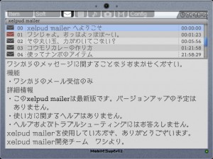
Within that, one was introduced before, “xelpud mailer”. (it’s mail, not mall).

With this players can read mail from the elder.
It hasn’t been confirmed yet how many individual pieces of mail there will be from the elder, but they are set in a way so that players receive them once certain conditions are met. So, adventurers can also play to try to receive all the different messages in the game.

This is also one of the new elements. A piece of software that records tombstones and conversations.
Although we would like for players to take notes while they’re exploring the ruins, it’s possible to record things such as important conversations or hints that should be checked frequently.

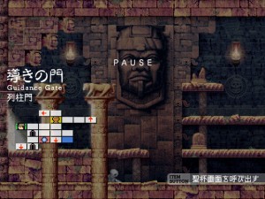
Although this is not a software screen, this is the pause screen.
The map will be displayed here.
This time, other than the field name, there are names for each room.
This is also a hint to solving the puzzles.
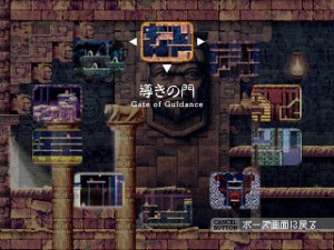
By the way, this is the holy grail menu that appears if you press the item use button while in the pause screen.
From here you can select the warp destination.


Oh god.
This looks amazing, and cool. Great user interface and improvements!
The music player G.U.I. looks very intuitive! 😀
I’m wondering if you have to find/buy the player, and unlock (or buy with gold coins in shops?) tracks as you find them/unlock them, or if you merely start out with all the music and player?
The paused mini-map looks very clean (Even if it isn’t translated just yet), and icons seem fairly easy to identify! 😀
Perhaps there will/should be a legend (icon identification implemented somehow/somewhere), just in case younger/newer (or even regular!) players of games can’t identify all the symbols.
The new warp feature looks easy to handle too, your handling of G.U.I for this version is spectacular! 😀
The piece of software that records tombstones and conversations sounds very convenient and smart, and will probably be a nice touch for those with poor memories, or just people in general who don’t like to write down notes. 😀
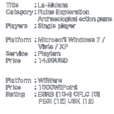
I’m wondering how many Wii-Points (100 points = $1) or just US $ the game will be priced at, I’m hoping it will be reasonably/fairly priced, and that if you must include add-ons/expansions not already apart of the game (I really enjoy/prefer games that either come with the entire content included, or release free expansions/add-ons later the best! 😀 ), that they are at least as cheap as possible (under $3/300 points)… Because I, and probably like many others who were able to finally able to afford a Wii, won’t be able to afford to spend money on expensive add-ons/expansions. This is my only big worry right now… 🙁
Anyways… Great Job so far, can’t wait to see it featured on the shop channel on Wii (If this is the final decision for the platform release)! 😀
Have you considered a built-in notebook? Some games allow the player to put custom notes on the map to record thoughts. When I played through la-mulana on PC I needed to keep a separate notebook. It would be cool if this functionality was built in (for example, this system is in System Shock 2, you can press N to leave a note)
This is a really amazing setup! I love how it separates itself from the original game. Thus making it feel like the original was just the tip of the excavation. All in all this looks like one of the best games of 2010! (or 2011 🙁 lol)
@James:
Yeah, I really hope they do keep that Kanji. It just looks so cool.
First, I’d like to express how gorgeous the menus look, especially the PAUSE screen. The Kanji atop the English equivalent looks very fitting, and I appreciate the inclusion of a name for each room.
In the original, having to equip the ROM combination of Antarctic Adventure and Comic Bakery to warp to back fields was somewhat tedious. Since the programs replace those ROM functions in the new game, I’m hoping that the Grail menu will also become easier to use. What I mean is that it would be good to be able to press a button while in the Grail menu, to make the menu switch to displaying back fields instead of front fields.
For example, in the image, the cursor is on Guidance Gate. The button press would make the Guidance Gate image change to Confusion Gate, and the other images in the ring would change as well, and another button press would reverse the change.
@Namo:
They should leave it that way. The presence of unfamiliar ideographs in a rustic typeface makes the ruins look more antiquated.
It really fills me with confidence reading these updates, that the WiiWare version of La-Mulana will be full of useful features that will ADD to the enjoyment of the game, rather than detract from it. Hope to hear about a release schedule soon!
RELEASE IT ALREADY GODDAMN
Wow, the names of the locations look all dramatic with the Japanese Kanji written over them.
I’m definitely liking some of the new features here. The Message Recorder and Music Player especially! The new Holy Grail also looks to be easy to use, since we don’t have number keys to press.
Unless you want to add keyboard support! Haha!
I don’t think I’ve been so excited to see interface previews before.
Every update this game just keeps looking more and more amazing…. can hardly wait!