 We’re currently in the midst of creating the menu.
We, NIGORO, are a relatively start-up and this will be our first time entering the console market.
Without strength there won’t be any knowledge or connection of NIGORO and La-Mulana.
And we can’t do campaigns or large-scale ads. We have to do everything on our own.
That’s why we try to take the way which cannot make it by the existing process of development and advertising such as making fans privy to information on the official site.
We’re showing it to you as it’s created to let everyone see and offer their opinions, it’s useful for the game development.
It’s almost as if the individuals who visit the official site and leave comments are members of NIGORO.
With that said, I, the game director will tell you a bit about the job.
I actually haven’t been playing any games these past few years.
I do have a Wii, but strictly for development purposes. I’ll download and play WiiWare games for a few minutes, but primarily for reference. That’s why any configuration necessary for Wii games don’t come to mind.
Right now, the topics below have come up that include things that are thought to be necessary and what became possibly during development.
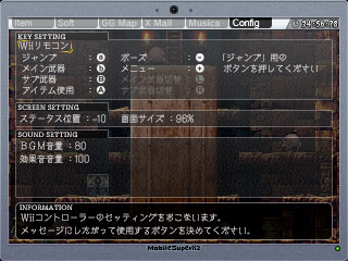
[ Key Config ]
We’re planning of course the Wii controller as well as the Classic Controller and GC controller and also planning to be able to set the keys while using the controllers.
The gray items are because the Wii controller only has a few buttons. If the Classic Controller is used, you can set the buttons to instantly switch menus and weapons.
[ Status Placement ]
We added this because when we made the game screen size, depending on the monitor, the top or bottom would not fit and the HP and money displays were cut off. So, the placement is decided by matching the top and bottom to the monitor.
[ Screen Size ]
This is similar to above, where a screen that would not fit within the monitor is reduced in display and adjusted. For the development steps, the length, width, top, and bottom placement can be set in detail, but as a visual lead, they don’t like any strangeness in the display ratio so we just enlarge or reduce based off of the center of the monitor.
I believe any other detailed setting can be adjusted with the TV monitor or Wii.
[ BGM/Sound Effect Volume ]
The ability to set the volume balance of the BGM and sound effect. Even within the development staff there were differences in how each person liked the song and sound effect balance, so it is settable.
How is this? Are there any config items you want or need other than those?
Please tell us!


I think you’re doing a great job already, fellas.
It already looks like the options menu from the original, but updated to look new. Keep what you have there. Its fine the way it is. (v^.^)/
RPK says:
“Maybe having some backgrounds for the professor’s PC instead of only the semi-transparent effect it has now would also be enjoyed. Maybe some of these backgrounds can be made to be found in pots, shops, or other locations?”
This is a really cool idea.
Blue Protoman, you should read the earlier posts. That has already been addressed.
Guys, it’s “Mail”, not “Mall”.
For those of you who can’t read Japanese, the control setup shown in the screenshot is:
a (1?): Jump
b (2?): Main Weapon
B: Sub Weapon
A: Can’t quite read this one… Item something?
-: Pause
+: Menu
And I think the L and R buttons are for cycling between the various Main and Sub weapons. It’s kind of hard to tell; I don’t know all the kanji, and the darkened text doesn’t help matters.
The “Screen Settings” box shows the placement of the status bar and the screen size, I think. “Sound Settings” is self-explanatory.
I really have no suggestions of my own; though I also hope that the game is compatible with the GameCube controller.
You guys should include an option to use the original 8-bit graphics in the game.
Retro items are pretty much out, as was already stated, so no retro interfaces this time. From the looks of it, the current field interface is fine as-is.
I have all three controllers on-hand, and it’s good that you’re working to accommodate all of them when making this game, plus being able to remap the buttons on an as-needed basis.
From what I know of the tabs and what I may be guessing…
[Item] This is where weapons, tools (secondary items like shurikens, bombs, and the shield), and quest items are stored. It’s likely the Grail will be marked as a tool given its function, but what about the Ankh Jewels? How will those be handled?
[Soft] Software, which we already saw. Can’t wait for further developments on this front.
[GG Map] Map of the ruins, perchance? And I’m guessing GG means Guidance Gate.
[X Mall] Yeah, I have this feeling it involves DLC, but it might also involve functions we haven’t been introduced to otherwise. Only time will tell.
[Musica] Sound test/jukebox. What else can it be?
Sounds great. I really appreciate the screen/status adjustments you’re including. It was a feature in Gradius ReBirth I really appreciated, since the edges of the display were slightly off across the top and bottom of my old CRT television. I always love optional button configuration, even if I rarely need to use it.
One suggestion, if it isn’t already in place is a Sound Test. Mostly for listening to the music at any time you get the itch for it, but listening to the sound effects in this manner is slightly interesting, too.
I haven’t played the PC version, so not entirely sure if my opinion will help.
I’m assuming the Wii Remote will be held on it’s side. So here is a quick run down of what I think should be the configuration. 1 button for attack, 2 button for jump, + for menu, – for map/other menu, D-pad for movement and the A button for any special or magic attacks. This would be my favorite configuration. Having the option to set the buttons ourselves is also a great feature.
good luck
parko
Perhaps a contrast bar would be helpful in setting monitors to make the game look more like it is inteded to look like.
The ability to change font color and choose between some font styles would be nice as well.
Maybe having some backgrounds for the professor’s PC instead of only the semi-transparent effect it has now would also be enjoyed. Maybe some of these backgrounds can be made to be found in pots, shops, or other locations?
Please GC controller is necessary. All personal joysticks (made in home) are GC controls.
Games like Bubble Bobble Plus (wii) only is possible to play with the classic controller and not with GC controller. This is a problem.
Kotai.
I don’t like the looks of that “X Mall” label…
DLC a gogo, baby.
I really hope you don’t loose it when making DLC, just the boss rush and maybe Hell, but I’ll be happier if Hell doesn’t needs to be downloaded.
Well, you told us already what you are not planning to add to the options, so I think you have pretty much all potential options in place.
Any way to include an option for ‘retro’ life/exp meters? (Similar to the ones in the original PC edition) I liked the simple clean look of the original interface compared to the new one.